
You are here
Changing distributions of London’s ethnic minority communities
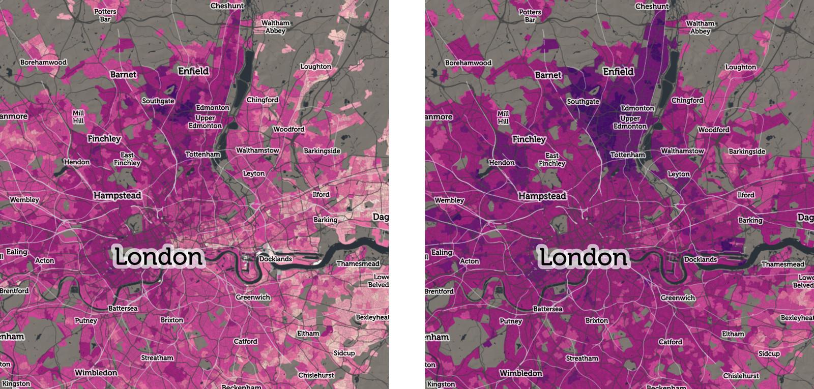
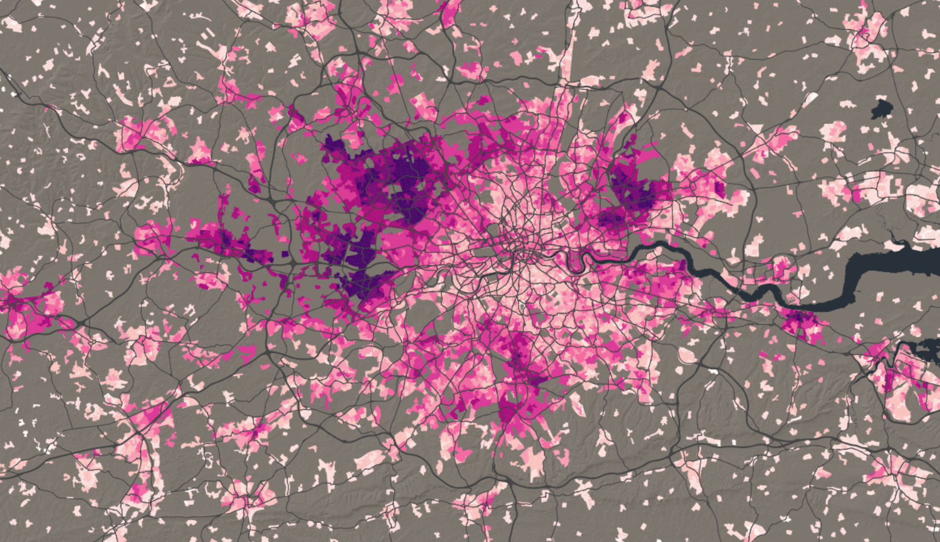 Variations in British Indian proportions in London
We usually find out about the changing ethnic composition of London’s neighbourhoods (and those of other places) using Census of Population data, but these are only collected every 10 years – and the last time was 2011. The strength of Census data is that they are made available for very small Output Areas, typically comprising 100 households and 250 individuals in urban areas. Census data record the ways in which people describe their household’s ethnicities, and these descriptions are aggregated into a dozen or so categories by the Office for National Statistics.
There are other ways of ascribing ethnicity to individuals and households. One that has been successfully developed by the Consumer Data Research Centre (CDRC), is to examine the associations between the given and surname of an individual and their ethnicity. This method makes it possible to predict probable ethnicity at the level of the individual. The CDRC uses nationwide lists of names and addresses, obtained from administrative and consumer sources, to predict ethnicity, and then aggregate the results to small neighbourhood scales.
The CDRC has compiled name and address data into national databases for every year from 1997 until the present day. As a result, it is possible to view the aggregated results on CDRC Maps, and view the kaleidoscope of neighbourhood change that has occurred over the last 20+ years. It is important to make clear that these results are only as good as the assumptions that were used to link names to ethnicity – and some groups, such as Black Caribbeans, are easily confused with the larger White British population – but CDRC researchers check our estimates with those recorded in census’s for the small number of years for which data are available.
In the case of London this approach allows us to create highly granular, annually updated neighbourhood measures of neighbourhood composition where examples of change are very difficult to infer from Census data alone (see case studies below).
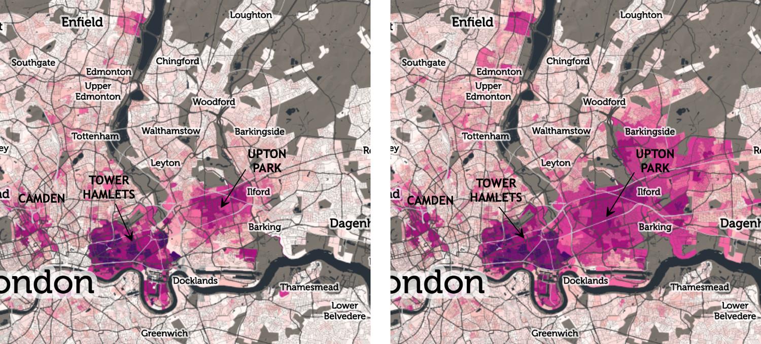
The eastward movement of individuals of Bangladeshi origin from Tower Hamlets, likely reflecting gentrification and redevelopment patterns in this Inner London Borough. The 1998 map, on the left, shows three distinct geographical groupings of the Bangladeshi community, in (from west to east) Camden, Tower Hamlets and Upton Park. The map on the right, from 2016, shows similar spatial footprints for the first two areas, while the Upton Park has expanded considerably southwards, eastwards and northwards, encompassing Barking, Ilford and Barkingside respectively.
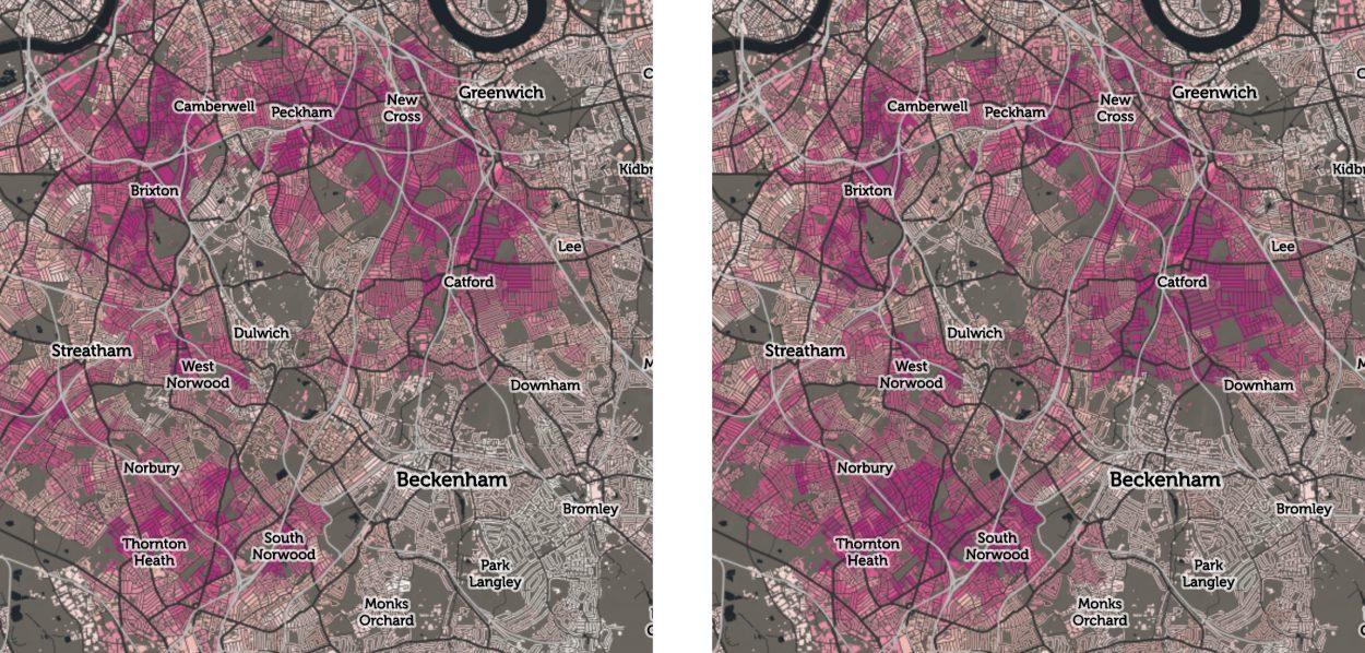
The extracts above show the 1998 (left) and 2016 (right) estimated Black Caribbean population of south London. There are clear increases in the more suburban south part of the map, around South Norwood and Catford, while the Brixton and Peckham populations to the north show a slight reduction, such that the proportions in the former now exceed the latter. Taken together, these movements amount to general drift from Brixton/Peckham, to South Norwood/Catford.
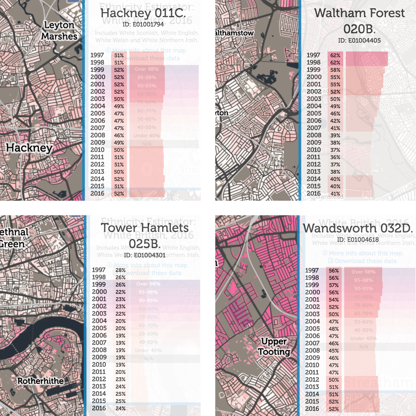
The maps also reveal recent (post-2011) increases in the White British (WBR) population, particularly in parts of Walthamstow, Shadwell and Tooting. In all these locations, the interactive maps (and their time-line graphs) show gradual decreases in the WBR % from 1997 to typically around 2010 or 2011, after which a gradual increase is seen, particularly in 2017, the last year of data. The decrease will have been captured by the 2001 and 2011 censuses, but the CDRC’s more recent data suggests a definite reversal in the trend since then. All three areas above were White British minority in 2010/2011, but in areas of Tooting there is now again a White British majority, while the section of Walthamstow shown is also once again approaching 50%.
Changes in neighbourhood composition of White Other populations in significant part reflects changes in the composition of this group, particularly following enlargement of the European Union, including Poland (2004), Hungary (2004) and Romania (2007) in particular. The CDRC maps nevertheless make it possible to infer neighbourhood change in the years immediately following these accessions, and also return migration in each of the years following the 2008 Financial Crisis.
It is possible to view these and other changes using the dropdown menu and slider bar on CDRC Maps. Whilst these very detailed changes are fascinating in themselves, they also provide a window on other social and economic changes taking place across the Capital, including migration, social mobility and housing market dynamics.
The maps that we have produced use CDRC’s Ethnicity Estimator software, which was developed in partnership with the Office for National Statistics. Interested readers can find the methodology that was used described in the PLOS One paper “Ethnicity estimation using family naming practices”. If you would like to apply to access the aggregated data behind these maps for your own research please see data.cdrc.ac.uk for further information.
Related news stories:
Are Poles returning home?
Has there been a ‘Brexodus’ of EU citizens since the referendum?